New User Interface
A fresh look, a future-proof foundation — and a quiet bet on what comes next.
With version 4.0, TRAX LRS gets more than a new coat of paint. The interface has been rebuilt from the ground up, and behind that visible change sits a decision about where software is heading. Here is the short version, in plain language.
A new look you'll recognize instantly
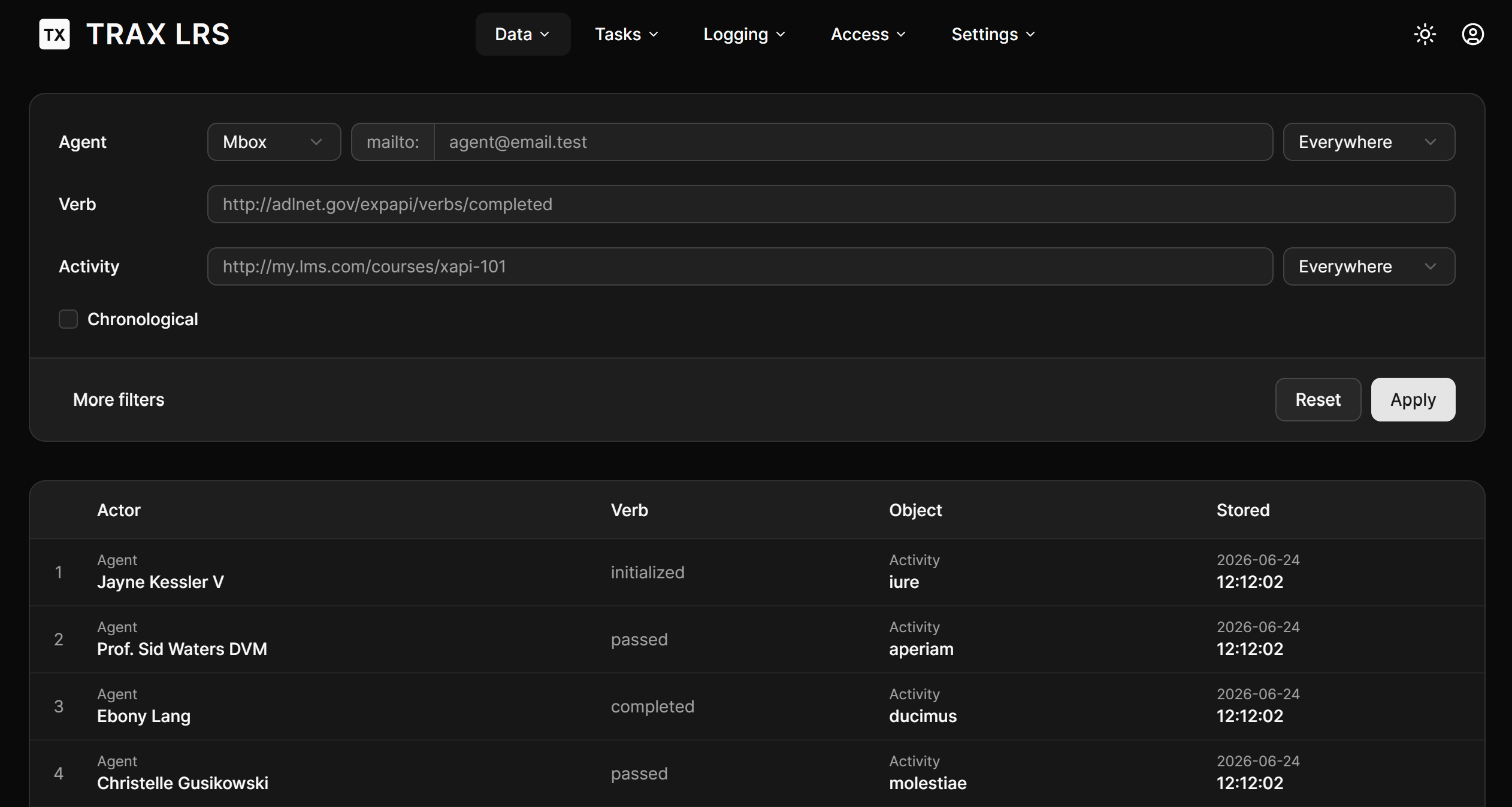
Open TRAX LRS 4.0 and the first thing you'll notice is the design: clean, calm, and black-and-white. We deliberately stepped away from a colorful, branded interface in favor of a neutral, modern one.
Does it have a little less personality? Honestly, yes. But that trade is on purpose. The new design follows the same conventions you already know from the apps you use every day — the same spacing, the same buttons, the same way menus and panels behave. Nothing to relearn. You sit down and it just feels familiar. Color is still there, but we now save it for the moments it actually helps you read something, rather than for decoration.
The result is an interface that gets out of your way and lets you focus on your data.
Why we switched to React
Most people will never see this part, but it matters. The previous version was built with a technology called VueJS — a genuinely excellent tool. The new version is built with React, paired with a popular design toolkit called shadcn/ui.
Why change something that worked? Because the world around us changed. Today, a huge share of software is written with the help of AI assistants, and those AI tools are strongest when working with React and shadcn/ui — it's simply what they've learned the most about. By adopting them, we make TRAX LRS dramatically easier and faster to build, improve, and maintain with AI in the loop.
For you, that translates into something simple: TRAX LRS can evolve faster, and stay on top of the leading technologies instead of slowly falling behind. The black-and-white look isn't just a style choice — it's the standard these modern tools are built around, so the design and the technology pull in the same direction.
The real reason we did all this
The redesign is the visible part. The interesting part is what it sets up.
We built the new interface around one simple idea: anything you can see and do on the screen, an AI assistant can do too — through the exact same controls you use. There's no hidden second system for the AI. It pulls the same levers a person does.
That unlocks a series of things that are hard to do well otherwise:
- A UI that tests itself more easily. Because every action is something that can be triggered cleanly, we can automatically check that the app keeps working as it grows — fewer surprises, more reliability for you.
- Documentation that writes itself. The same structure lets us generate up-to-date guides and screenshots from the real application, instead of by hand.
- A built-in assistant. Down the road, an AI copilot can sit inside TRAX LRS and help you explore your learning data — filtering, searching, and inspecting records on your behalf, while always respecting what you're allowed to see.
Where this leaves us
TRAX LRS 4.0 is, on the surface, a cleaner and more familiar product. Underneath, it's a foundation deliberately chosen for the age of AI-assisted software — quicker to evolve, easier to keep reliable, and ready for a future where the interface doesn't just respond to your clicks, but works alongside you.
A simpler look today. A much more capable product tomorrow.